
Case study / 03

Kudark

A homeware manufacturer with genuinely good products and a website that made them look like a commodity supplier.

Client
Kudark
Year
2025
Role
UX consultation, design, development
Stack
Next.js, headless CMS, Vercel
Status
Live
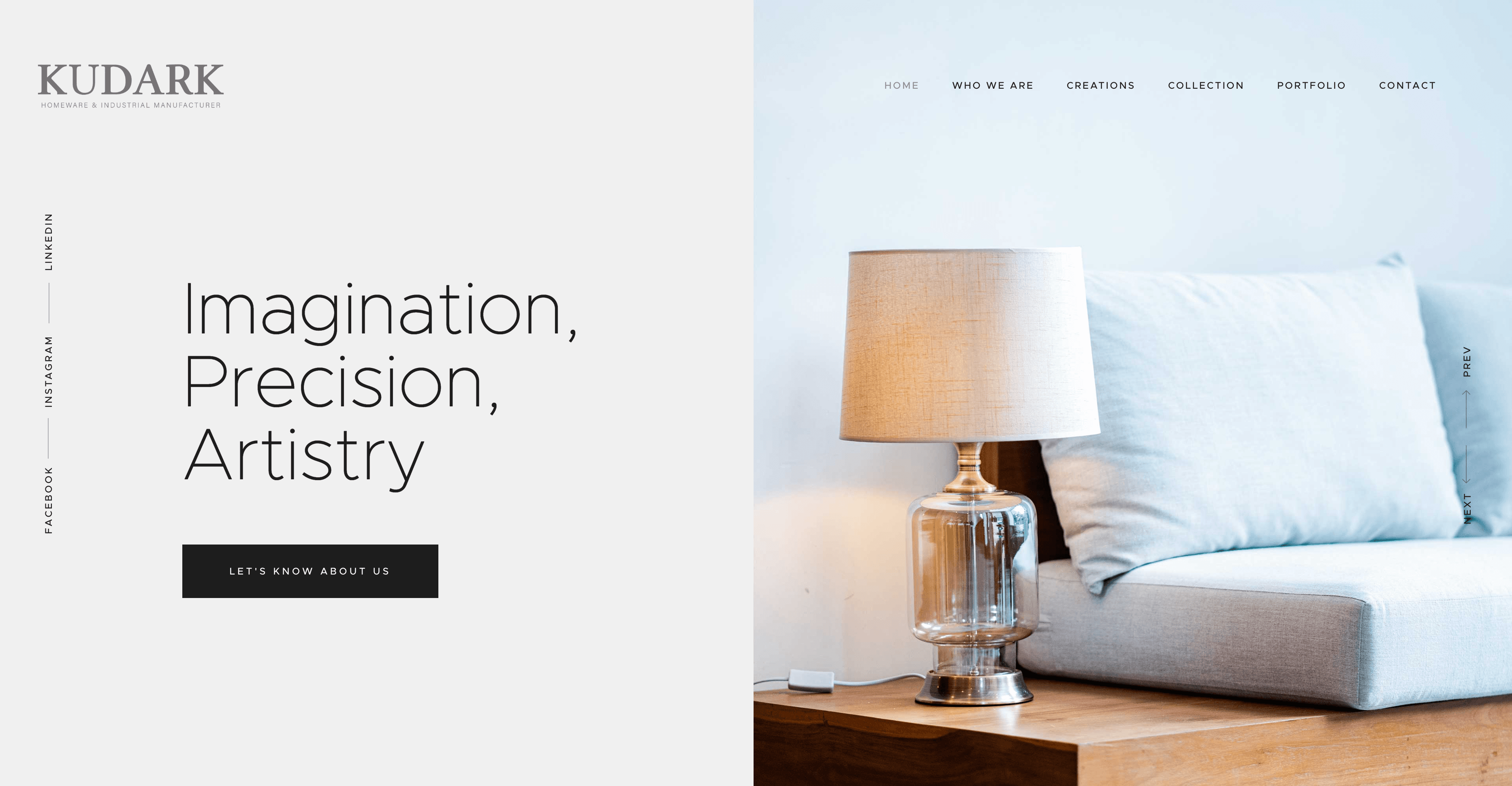
Kudark homepage

01

The problem

Everything was photographed on white and listed in a table. The products are made well and the finish is the whole argument, and none of that survived a spec sheet layout.

The team also could not describe what they wanted, which is normal. What they could do was point at things they liked and say why — so that is what the first session was built around.

02

The approach

We led with material. Large photography, generous space, and a product page that opens on the object rather than on a table of dimensions — the numbers are still there, they are just no longer the pitch.

The range was regrouped by use rather than by manufacturing category, which is how a buyer thinks and is not how the factory thinks.

03

The build

A small Next.js build with the product range in the CMS, so a new line is entered once and appears everywhere it belongs. Images are resized and converted on upload.

Because photography carries the whole site, the image pipeline got the most attention: explicit dimensions everywhere, modern formats, and lazy loading below the fold.

▪ Outcome
Largest Contentful Paint on mobile
1.6s
Larger product photography, same page weight
3x
To add a new product line, down from a sprint
1 day
Lighthouse performance, mobile
96

Indicative figures — replaced with the client’s own analytics once supplied.

We came with a vague idea and left the first call with a scope we could actually approve. The site looks like the products we make.
Akila Kudaliyanage
Founder · Kudark